Project description
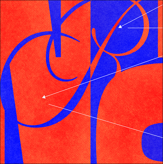
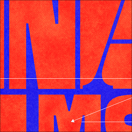
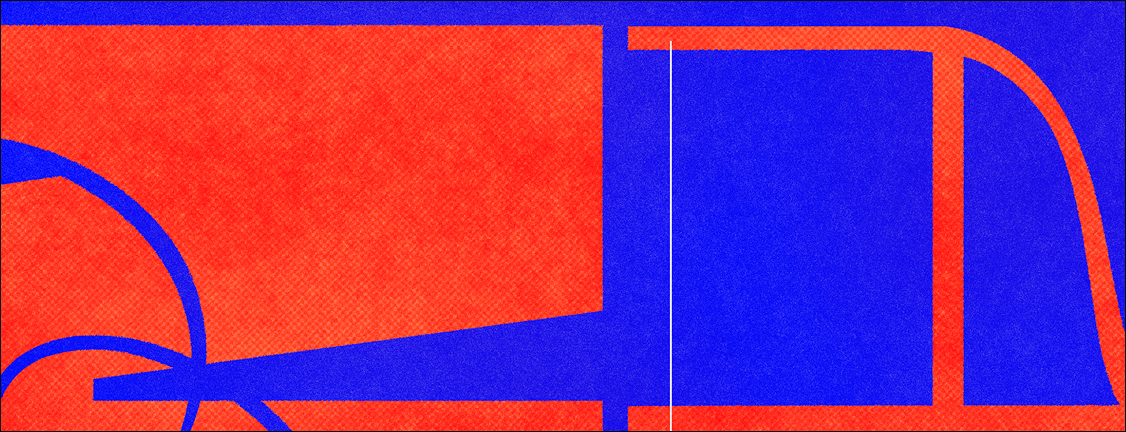
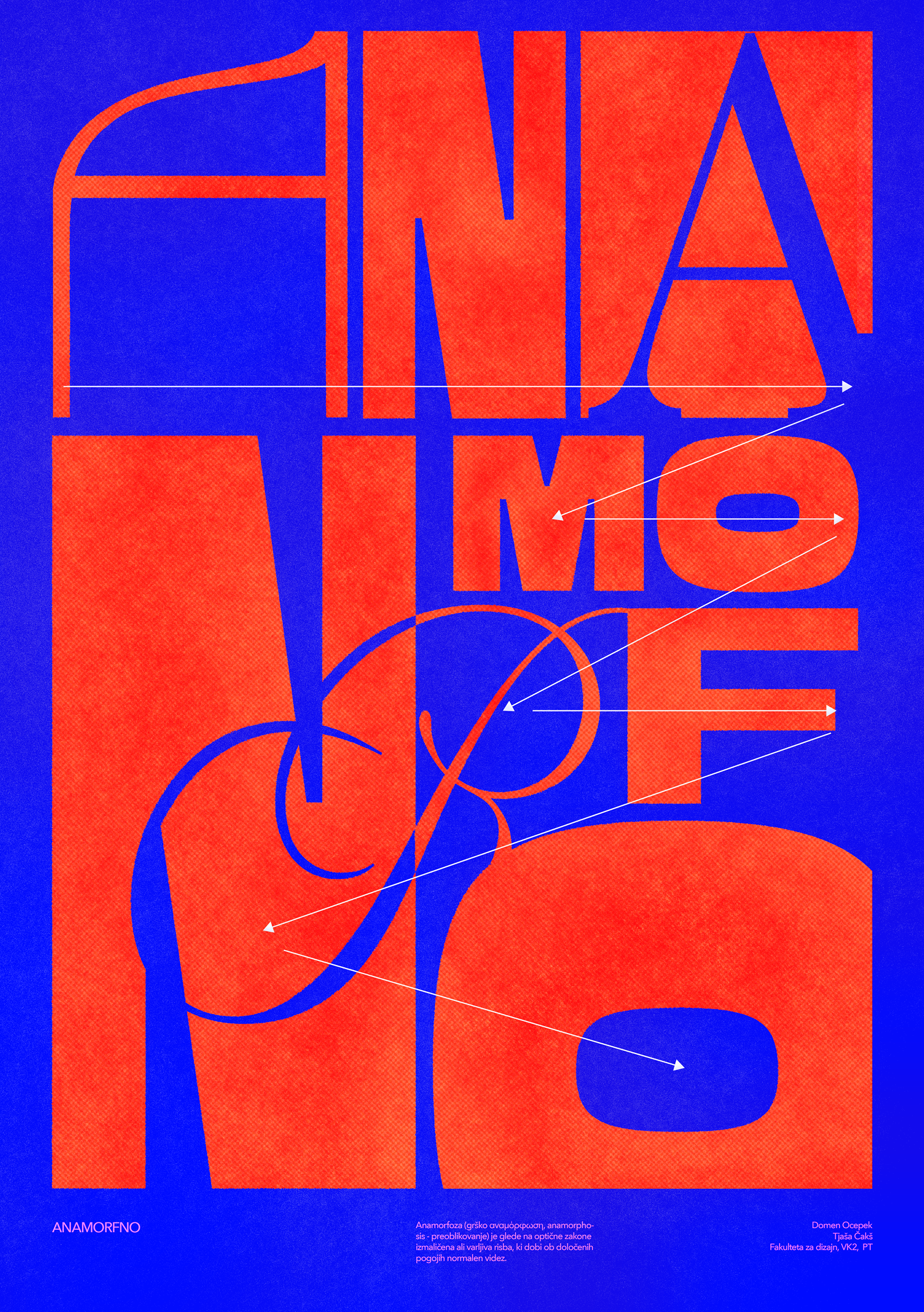
For the poster, I chose the word "anamorphic" and a typographic approach, as I was drawn to the idea of a distorted image that only becomes legible from the correct viewpoint or with a specific hint. I translated this concept into typography by making the word illegible at first glance – I broke, stretched, and arranged the letters so they function as a pattern rather than text. To aid in deciphering it, I added arrows to guide the viewer through the composition, allowing them to gradually piece the word together. I built the composition on contrasts: large letter shapes against thin lines, orange against blue, and dense and open areas, which creates rhythm and dynamism.
Project tip
Printing and printed matter
Summer
2025
My vlog
Design