Project description
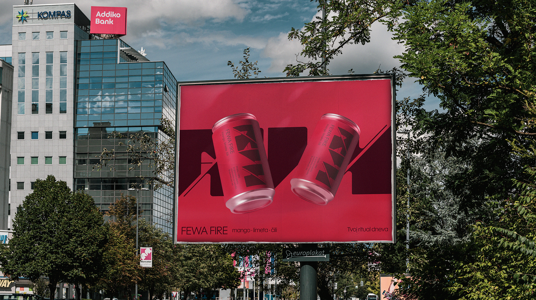
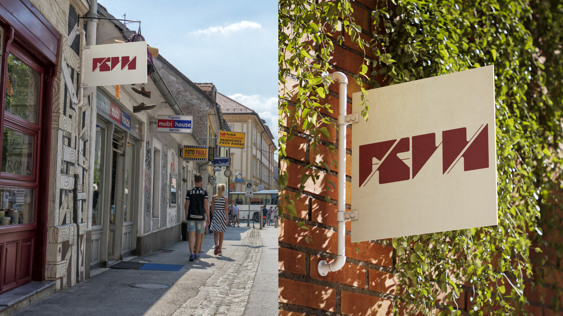
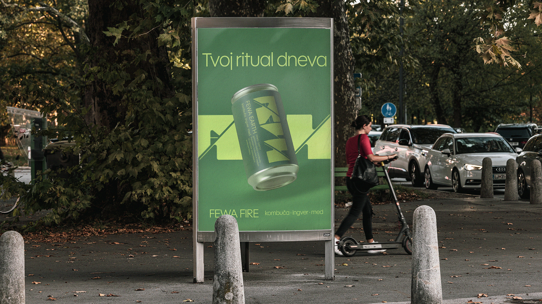
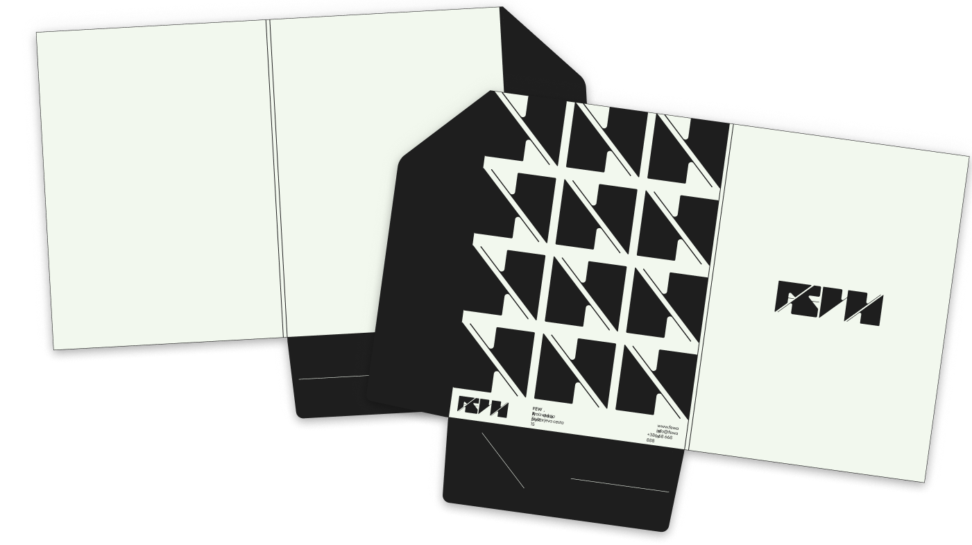
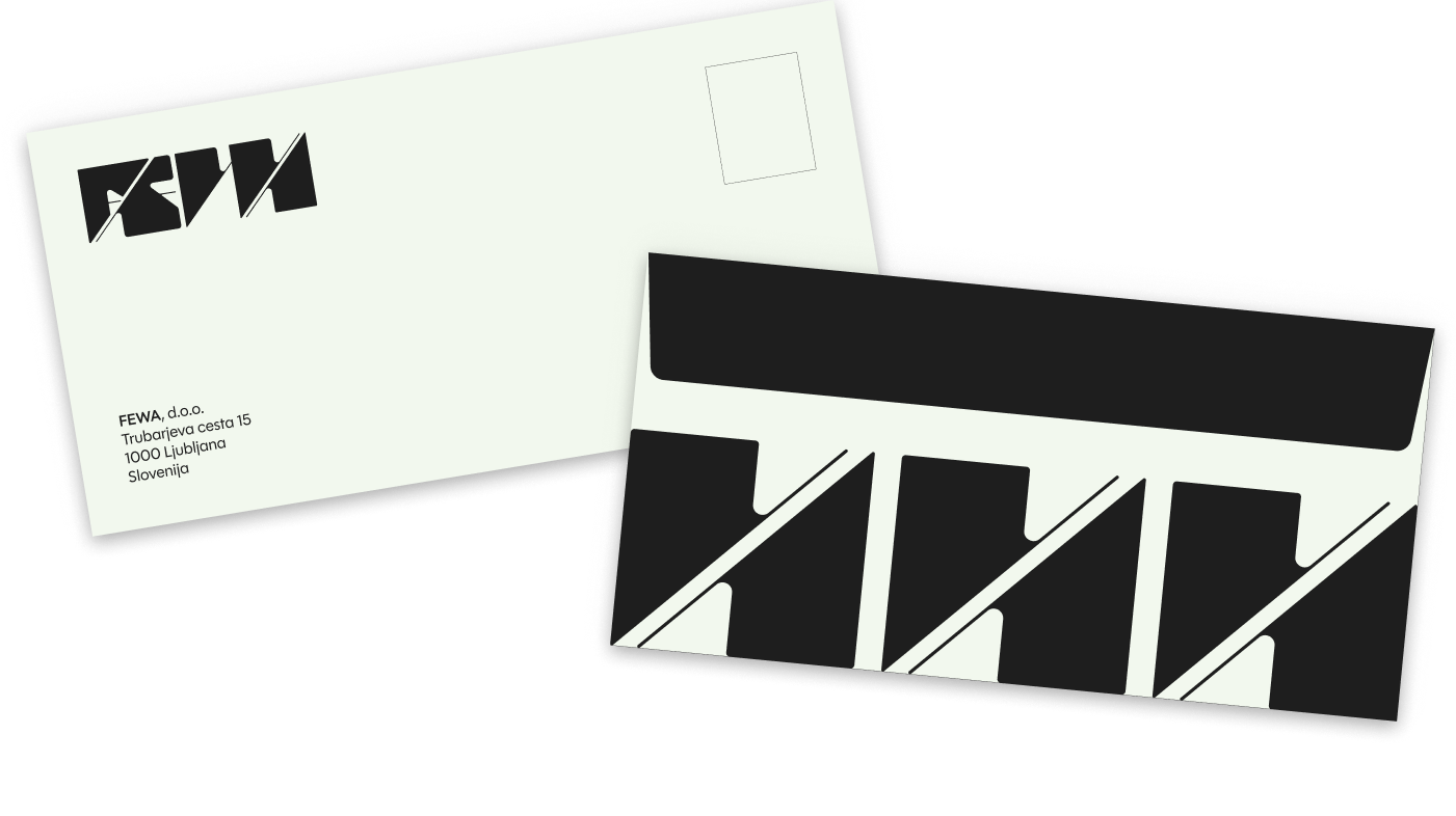
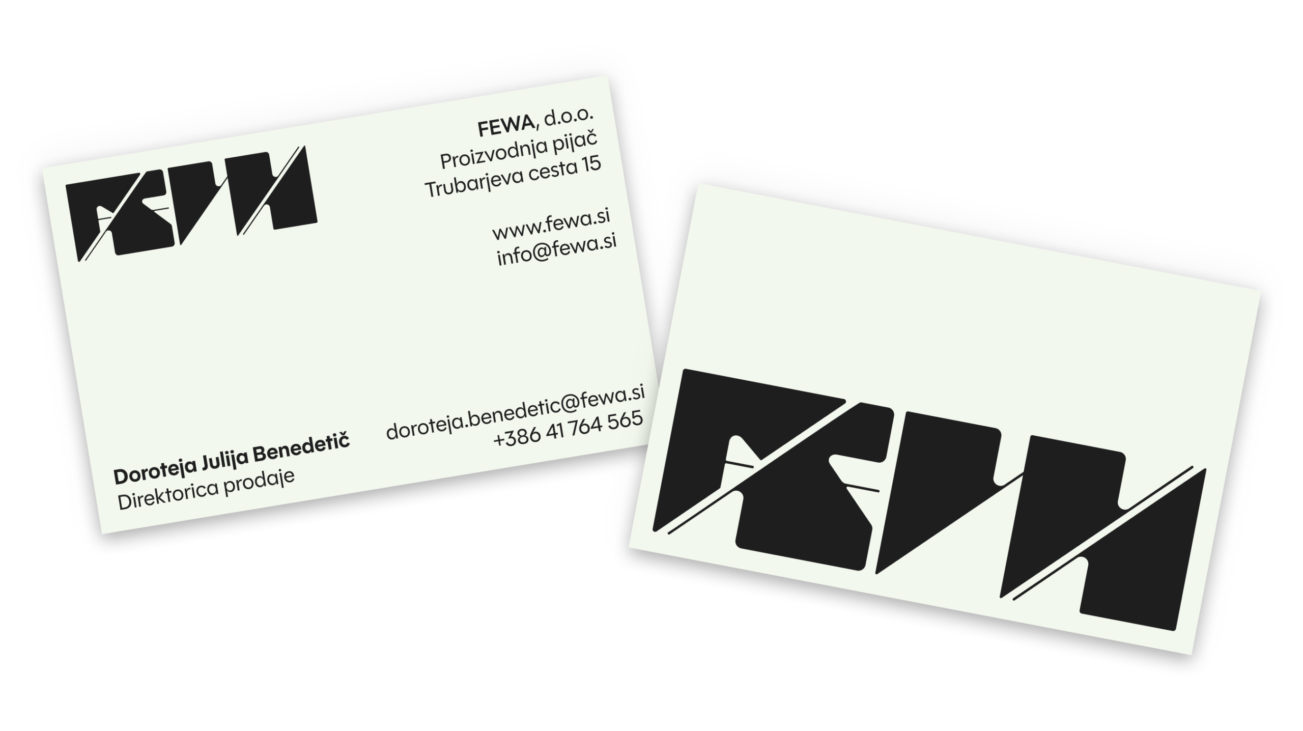
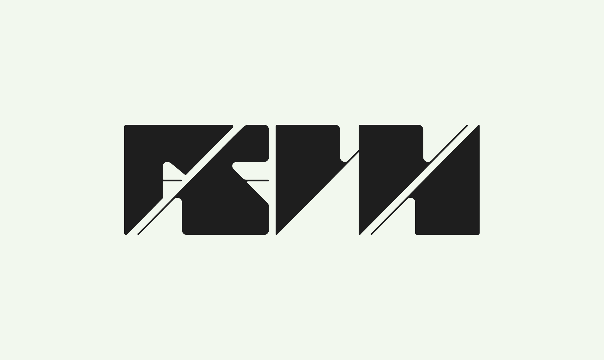
The complete graphic design and packaging for the FEWA brand, created under the mentorship of Nataša Vuga, is based on handmade typography and the concept of the four elements – Fire, Water, Earth, and Air. Each drink symbolises a certain state of being, and the user chooses it according to their current condition. The visual system is designed to be simple, clear, and recognisable, with the aim of creating a connection between the product, its message, and the user's daily ritual. The project is still in development.
Project tip
Corporate identity and packaging
Summer
2026
My vlog
Design